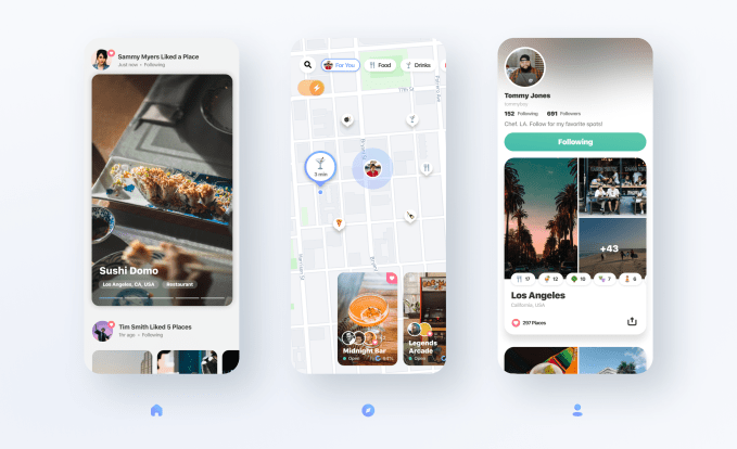
When you’re exploring a city — whether one you’re visiting on your travels or your own — there are a number of tools that can help you find out where to go, what to see and what to do, like Google Maps, Yelp, TripAdvisor and others. But a startup called Welcome thinks that today’s set of tools could be smarter and more personalized to the individuals who use them. Its new app instead uses “real-time” technologies to make recommendations that take into account a user’s preferences as well as other details about their current context — like the weather, season, traffic and the popularity of the place at the current time of day — in order to provide a better-curated set of recommendations.
The end result is meant to be a city guide that’s more like “a concierge in your pocket,” says Welcome co-founder Matthew Rosenberg.

Image Credits: Welcome
Rosenberg says he was inspired to build Welcome after traveling, pre-pandemic, with his then-girlfriend, now-wife, following the acquisition of his first company, a mobile video creation app called Cameo, by Vimeo. During this time, the couple explored parts of Europe, Latin America, and the U.S., which was an amazing experience he says, and one that ultimately brought them closer together, as it turned out.
“But something I found myself doing in those moments — we’re in all these beautiful places…we’re in an incredible museum or at a wonderful lunch — and I found myself hunched over my phone, trying to figure out where to go next,” Rosenberg explains. He was sifting through Google Maps, recommendations from friends and trying to read reviews to make a decision about what was next on their journey.
This led him to wonder: “why isn’t there a tool that like can be smart and go beyond just place [recommendations] — that can really look at what’s going on in my life and in the world around me, and make smarter recommendations?” he recalls.

Image Credits: Welcome
This led to the development of what’s now become Wonder, a city guide app that combines intelligence, recommendations, personalization, and even media, like photos and videos, to help users find things to do.
The startup is co-founded by fellow Vimeo employees Peter Gerard, Mark Armendariz and Mark Essel, who together with Rosenberg launched an early version of Welcome back in 2019 as something of a market test. Their idea landed them some seed money from Accel, which gave them enough runway to build the version of the app they had in mind.
That version has now arrived on the App Store.
Upon first launch, you’ll give Welcome some input about your interests and you’ll have the option to pick from a series of publishers to follow — like Condé Nast, Lonely Planet, Eater, Culture Trip, Food & Wine and others — whose content is used to help inform Welcome’s recommendations.

Image Credits: Welcome
You can then scroll through the app’s home feed to see relevant articles for the city you’re currently researching or browse the map, where suggestions are marked with icons related to the place — like a cheeseburger for a restaurant, martini glass for a bar, tree for an outdoor place (like a farmers’ market), and so on.
As you tap into each place, you’ll be presented with photos and videos, and links to get directions, the website, the phone number, as well as a button to order an Uber or Lyft, and more. You can also leave your own tips for fellow Welcome users, mark the list as a favorite and add tags.
As you browse the map, buttons at the top let you filter to see only a subset of places, like food, drinks, activities, arts and more.
The app itself is well-designed in terms of the look of its user interface, but it’s perhaps not as simple to use as an app that’s more heavily focused on collecting user-generated content — like business ratings and reviews.
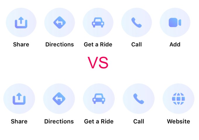
It was not immediately obvious, for example, how you could contribute your own photos and videos to a place, as some listings offered a prominently placed “Add” button for uploading your media, while it seemed others did not. In reality, the “Add” button wasn’t missing — you just had to scroll over to the right to see it. But it wasn’t clear that the row was scrollable. It looked like the Add button simply wasn’t there. (See below examples.)

Image Credits: screenshots from Welcome
Still, Welcome’s underlying data and parsing engines are interesting. The team developed custom tools that pick up keywords in the articles from publishers and turn them into tags. Eventually, it wants to expand this technology to any site — like local blogs, for instance — which users could click and save, perhaps via a web browser extension. The team is even thinking about offering a way to ingest the travel lists and tips people collect in less obvious places — like spreadsheets, notes and emails.
In time, Welcome would also like to better integrate suggestions and guides from travel content creators to enhance its recommendations further. This could also later aid its business model, where premium travel guides from specific creators or publishers could be made available for a fee. The company also plans to add more ways to transact in-app, like booking tickets or other activities where a revenue share would be involved.
Before its public debut, Welcome grew to over 50,000 beta users across more than 350 cities worldwide and now has over 6.5 million places its database. It’s offering over 300,000 curated recommendations globally, at launch.
The startup is backed by a $3.5 million seed round led by Accel, with Lakestar Ventures participating. The round closed in 2020 but hadn’t yet been announced. Including pre-seed funding, Welcome has raised $4.2 million to date.
Welcome’s app, for the time being, is available on iOS only as a free download.
